Woolworths • Bunch
Helping shape the future of a food community through continuous product evolution.
- Role
Creative Designer | UX/UI
- Year
2024 - Present
- Deliverables
UX/UI
Visual design
Developer Handoff
Overview
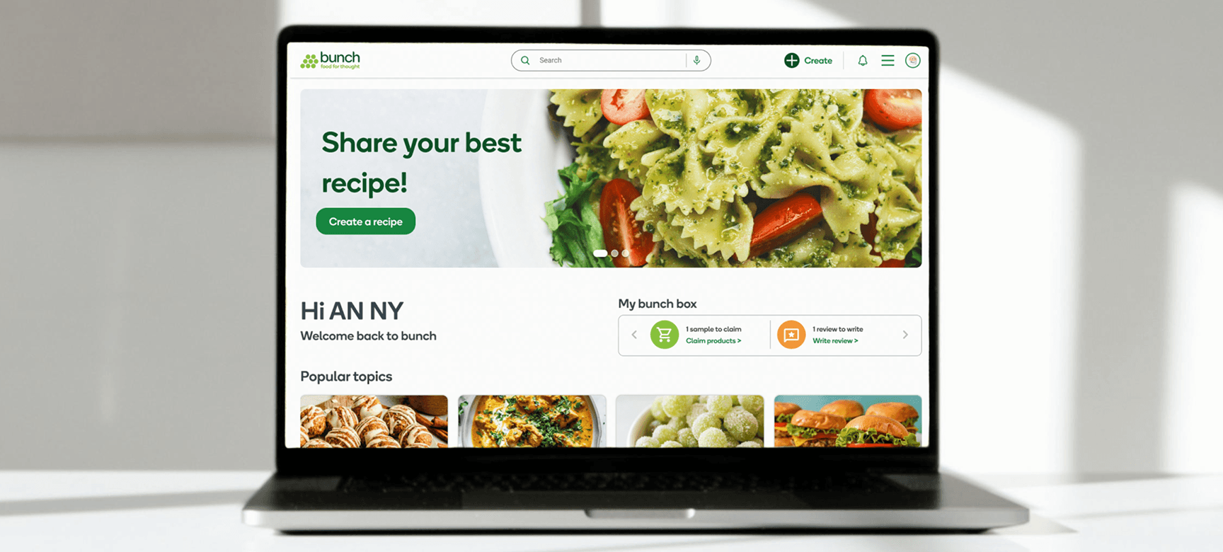
Bunch is Woolworths' members-only online food community, with approximately 100,000 members who discover recipes, review products, receive free samples and connect with fellow food lovers.
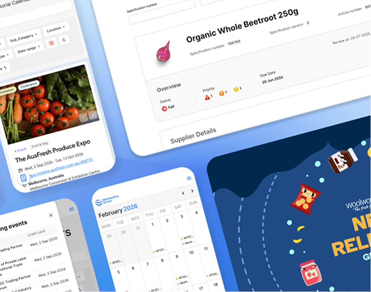
Unlike designing a product from scratch, working on Bunch meant designing for an evolving platform with an active community and an established user base. Across two years, I contributed to dozens of product improvements, community initiatives and future concepts that helped make Bunch more engaging, easier to use and better connected to the wider Woolworths ecosystem.
Rather than focusing on one large redesign, this project became an exercise in continuous product evolution: using small, intentional improvements to create meaningful change over time.
Impact At A Glance
Increased engagement
Increased average session duration from ~1 minute to ~3 minutes by redesigning the sample claim journey into a content discovery experience.
Improved operational efficiency
Saved moderators an estimated 2–3 hours per week by reducing repetitive questions, while helping members find important information immediately at the top of each discussion.
Continuous product evolution
Contributed numerous shipped improvements, seasonal campaigns and community initiatives across a live product over two years.
Long-term product vision
Developed future concepts that reposition Bunch from a community website into a personalised cooking companion integrated with the Woolworths ecosystem.
The Opportunity
As the community continued to grow, new features and campaigns were added regularly.
While this kept the platform active, it also introduced opportunities to improve engagement, simplify common tasks and better connect the different parts of the experience.
My work fell into two broad streams:
- Improving today's experience through shipped product improvements.
- Exploring tomorrow's experience through future concepts and product vision.
Part 01
Improving Today's Experience
Many of the most valuable improvements weren't large redesigns.
They were carefully placed interventions at key moments of the user journey that encouraged engagement, reduced friction and made the platform easier to manage.
1. Increasing Engagement Beyond Sample Claims
The Opportunity
Many members visited Bunch with a single goal, to claim a free product sample.
Once the sample had been claimed, there was little reason to continue exploring the community, resulting in very short sessions and limited exposure to recipes, articles and discussions.
The Solution
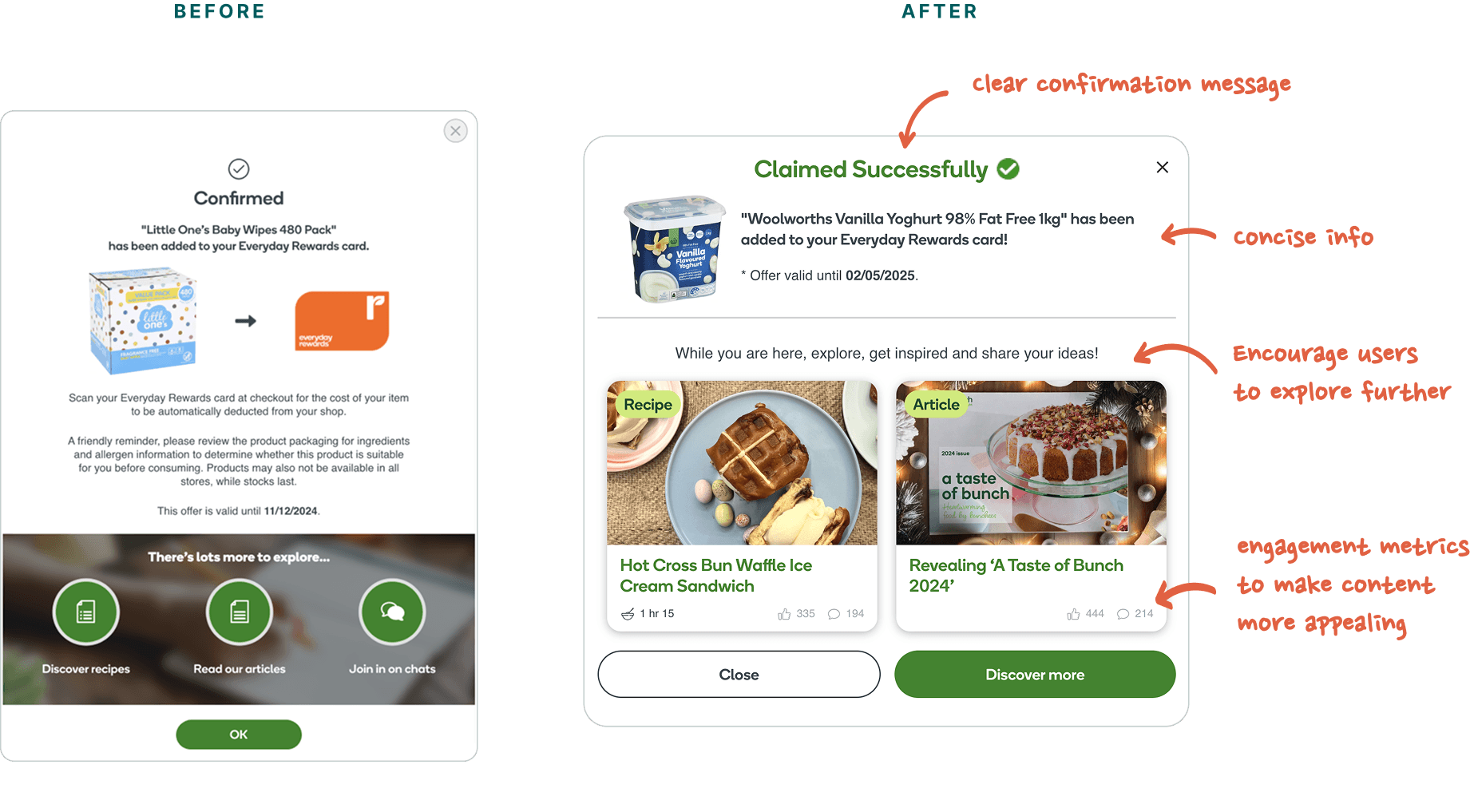
After a successful claim, the confirmation experience was redesigned into an opportunity for discovery.
The new pop-up surfaced related recipes, articles and community content while the member was already engaged, encouraging them to continue exploring rather than immediately leaving the platform.
The Impact
Average session duration increased from approximately one minute to three minutes, representing a significant improvement in post-claim engagement.
More importantly, the redesign transformed the sample claim from the end of a journey into the beginning of one, encouraging members to discover more of what Bunch had to offer.
A small UX intervention at a critical moment in the journey created more opportunity for members to explore the wider community.
2. Reducing Moderator Work Through Better Communication
The Challenge
Moderators regularly answered the same questions beneath product posts and community discussions.
Important information quickly became buried within long comment threads, making it difficult for members to find answers and creating unnecessary repetitive work for the moderation team.
The Solution
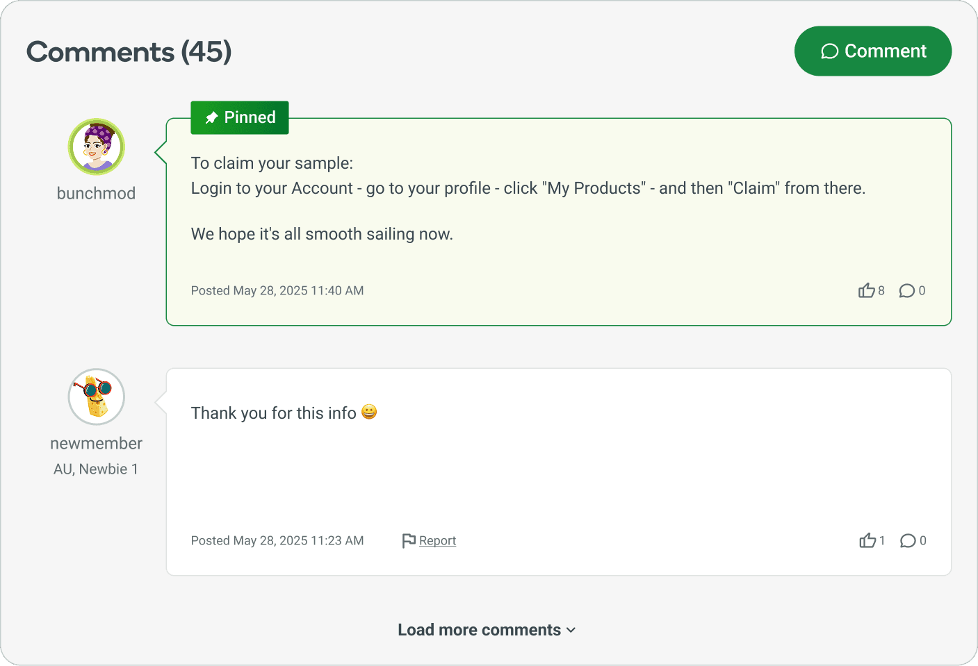
I designed pinned moderator comments, allowing key announcements, instructions and FAQs to remain permanently visible at the top of discussions.
This ensured members saw important information immediately without searching through lengthy conversations. At the same time, it reduced the need for moderators to repeat the same information across active discussions.
The Impact
The feature improved both sides of the experience, saving approximately 2–3 hours per week across community teams while creating a clearer experience for the community.
3. Keeping The Community Active
Alongside larger feature improvements, I designed a range of smaller experiences that supported different moments in the member journey, contributed to a product that felt more engaging, more current and more rewarding to return to.
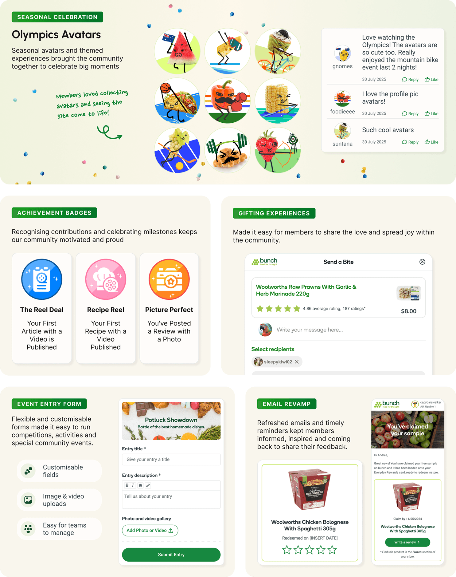
Together, these initiatives gave me experience designing across a range of touchpoints while maintaining a consistent experience within an evolving product.
Part 02
Designing the Future of Bunch
As the platform continued growing, I began exploring a larger question:
How could Bunch evolve beyond a traditional online community into a personalised cooking companion?
Rethinking the overall product experience, I explored how the entire member journey could become more connected, more personalised and more useful.
1. From Content Feed To Personal Dashboard
Before
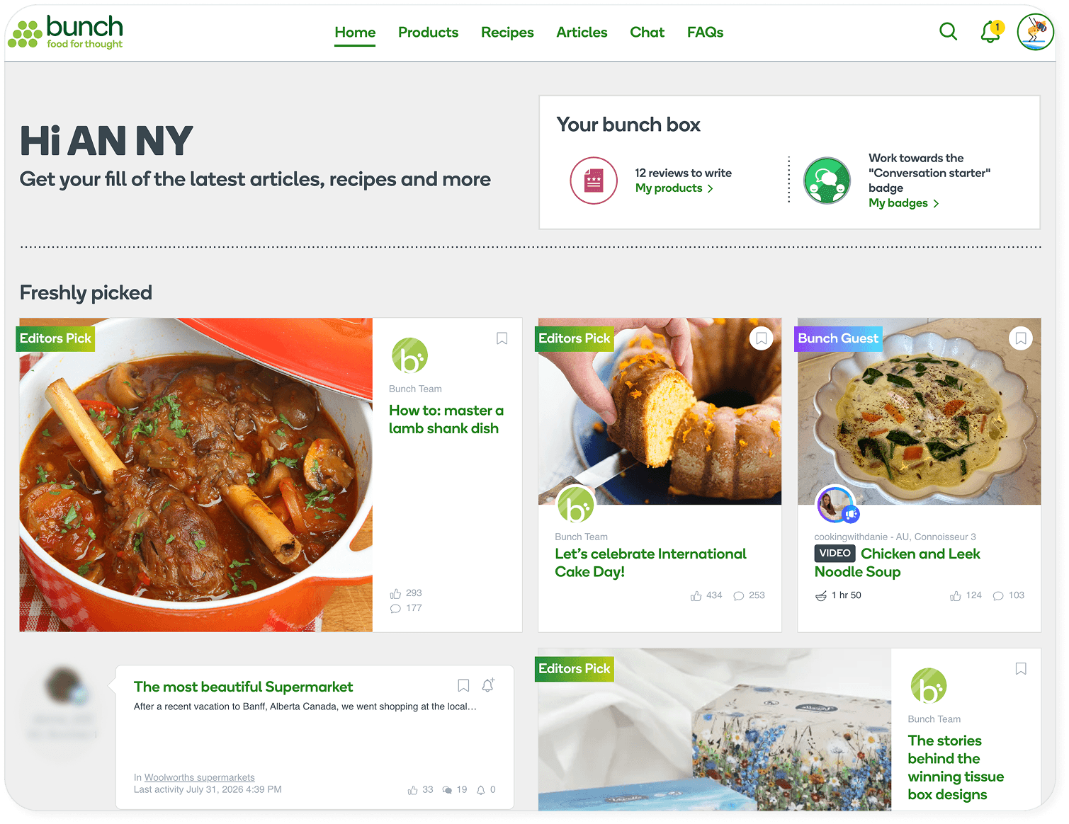
The existing homepage primarily functioned as a chronological content feed.
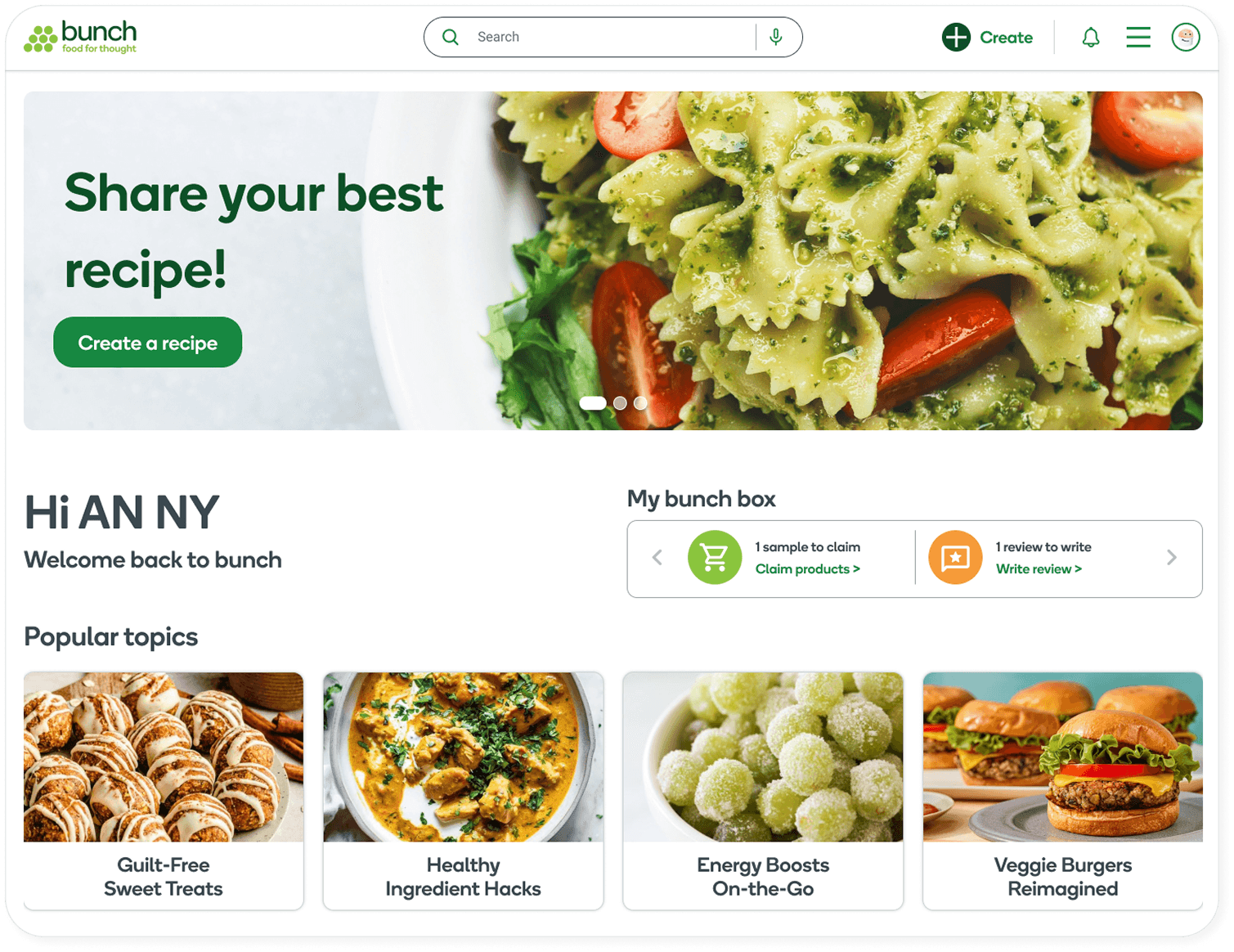
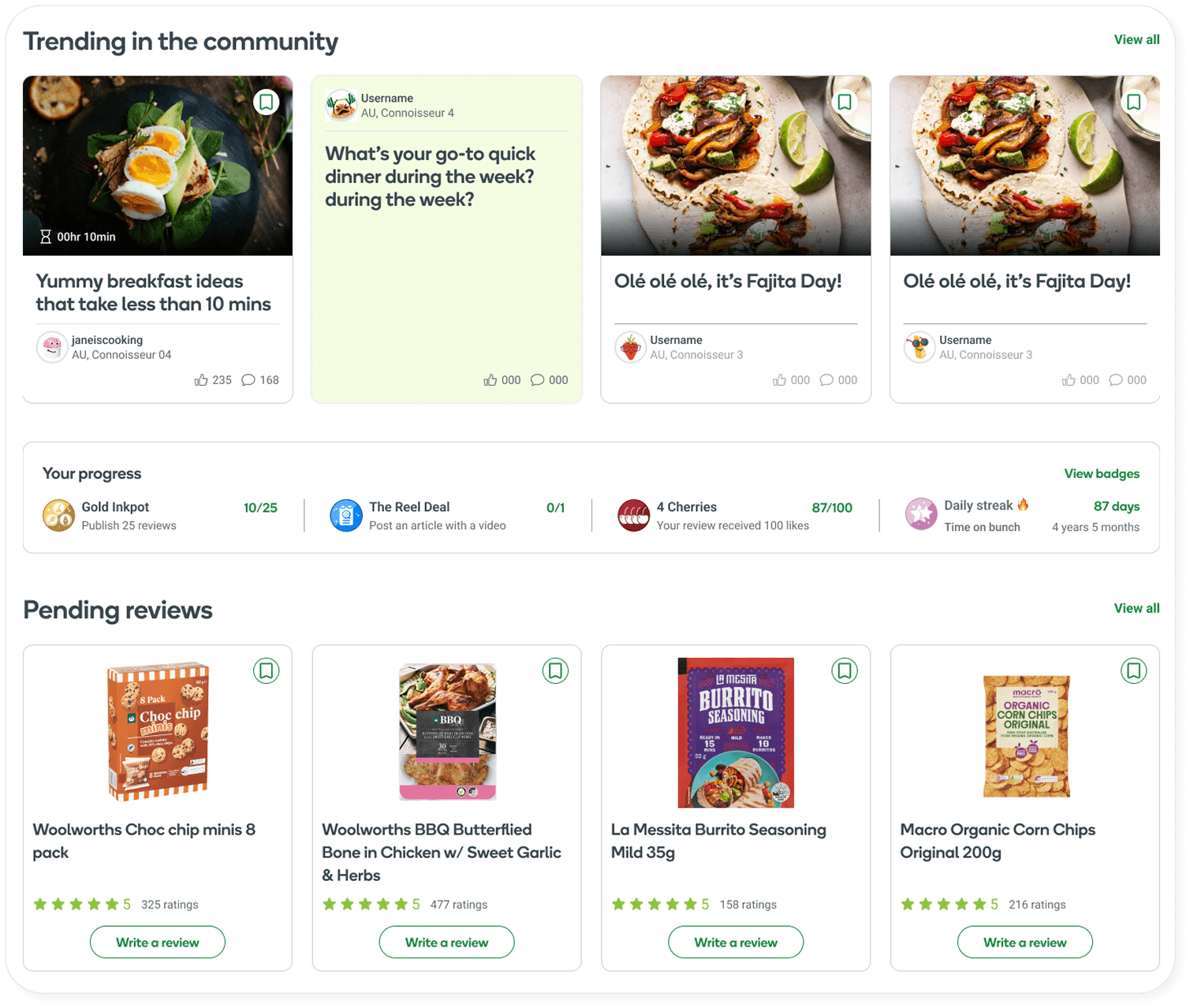
After
The redesigned dashboard instead adapts to each member's goals by surfacing personalised recommendations, pending reviews, popular discussions, community achievements, cooking inspiration, ect. The goal was to shift the homepage from simply displaying what was new to helping members understand what was relevant to them.
2. Connecting Community And Shopping
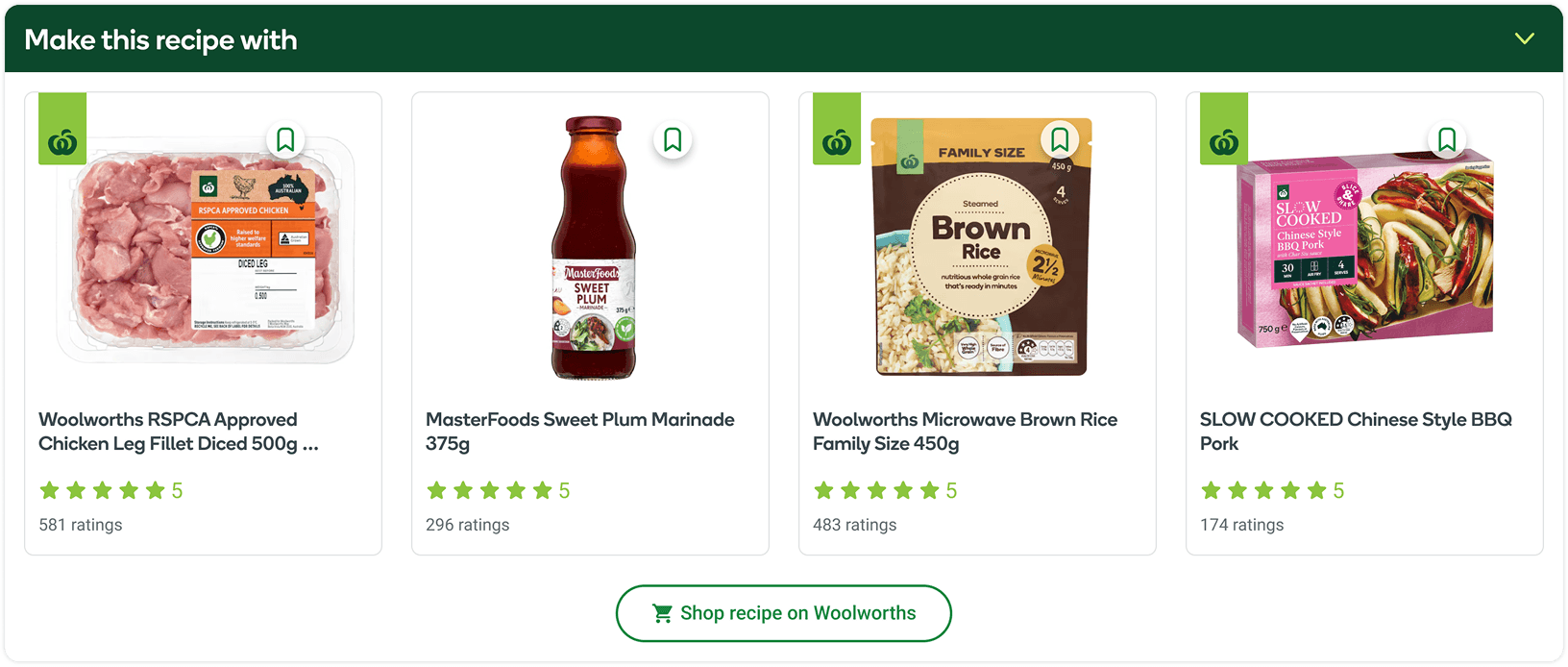
One opportunity became increasingly clear throughout the redesign process: Members regularly discovered recipes on Bunch before manually searching for ingredients on Woolworths.
The proposed shopping experience closes this gap, connecting inspiration to action: discover a recipe → see the relevant Woolworths products → add them to a cart.
3. A Vision For The Future
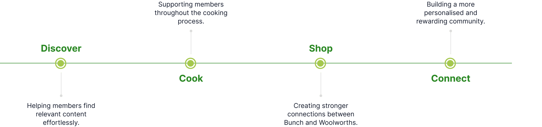
These concepts were organised into four strategic product pillars. Together these initiatives establish a long-term vision that extends Bunch beyond a traditional online community into a more connected ecosystem centred around food, cooking and shared experiences.
Reflection
Bunch taught me that product improvement doesn't always come from a major redesign. Working on a live community meant constantly balancing member needs, business goals and platform constraints, often through small changes at specific moments in the experience. It strengthened my interest in taking on broader product ownership - understanding not only how to improve an individual interaction, but how individual decisions fit into a product's larger goals, ecosystem and direction.
Next Projects