Designing Enterprise Products at Woolworths
- Role
Creative Designer | UX/UI
- Year
2025, 2026
- Deliverables
Website
Visual design
Developer Handoff
Designing intuitive internal experiences that turn complex, spreadsheet-driven workflows into clearer ways to find and use information.
This case study showcases real products designed at Woolworths. To protect confidential business information, selected screenshots, datasets and content have been anonymised or recreated. The workflows, design challenges, decisions and user experiences accurately reflect my contributions to these projects.
Overview
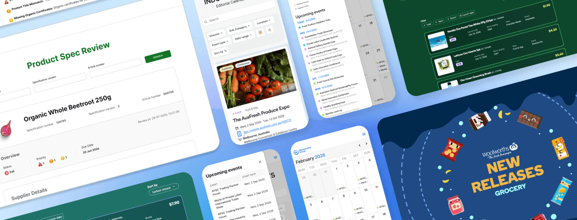
During my time at Woolworths, I've contributed UX/UI design across a range of internal web applications used by different business teams to manage product launches, industry events and compliance reviews.
Although each product served a different purpose, they all shared the same challenge:
Operational information was scattered across spreadsheets, disconnected systems and structured datasets.
My role was to transform this complexity into digital products that were intuitive, searchable and easy to navigate.
Together, these platforms replaced spreadsheet-driven workflows with purpose-built digital experiences that supported teams throughout the product lifecycle.
Enterprise Products
What I Focused On
Although each platform solved a different business problem, I approached every project using the same principles.

Design For Decision Making
Users weren't looking for data. They were trying to answer questions.
Every interface was designed around helping users reach decisions quickly rather than simply displaying information.

Reduce Cognitive Load
Enterprise systems naturally contain large amounts of information.
I organised information into clear visual hierarchies that surfaced the most important content first while allowing users to progressively explore additional detail.

Prioritise Scanning
Internal users often spend only seconds finding what they need.
Large headings, visual grouping, colour, spacing and typography were used to create interfaces that could be scanned rather than read.

Create Consistent Experiences
Although each platform addressed different workflows, consistent navigation, filtering behaviour, layouts and interaction patterns reduced the learning curve across products.
Product 01
Industry Events Platform
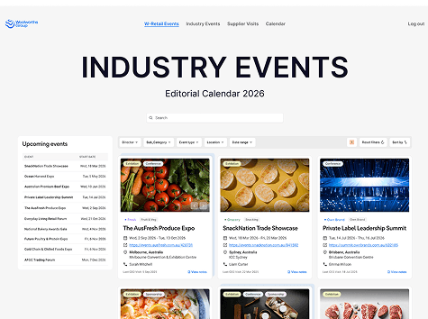
A searchable event management platform replacing spreadsheet-based event tracking.
Problem
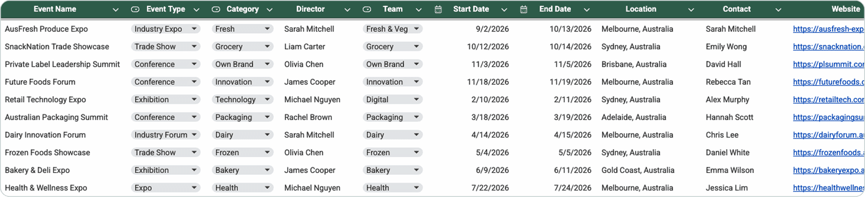
Industry events were previously managed through spreadsheets containing dozens of attributes for every event.
As the database grew, users found it increasingly difficult to locate relevant events, compare upcoming opportunities and manage historical records.
The challenge was to transform spreadsheet data into an experience that supported rapid discovery rather than manual searching.
Design Objectives
- Improve discoverability through search and filtering
- Simplify navigation across a growing event library
- Support multiple browsing behaviours
- Create a responsive experience across desktop and mobile
Before
Previously managed across multiple spreadsheets and hundreds of event records.
Key Design Decisions
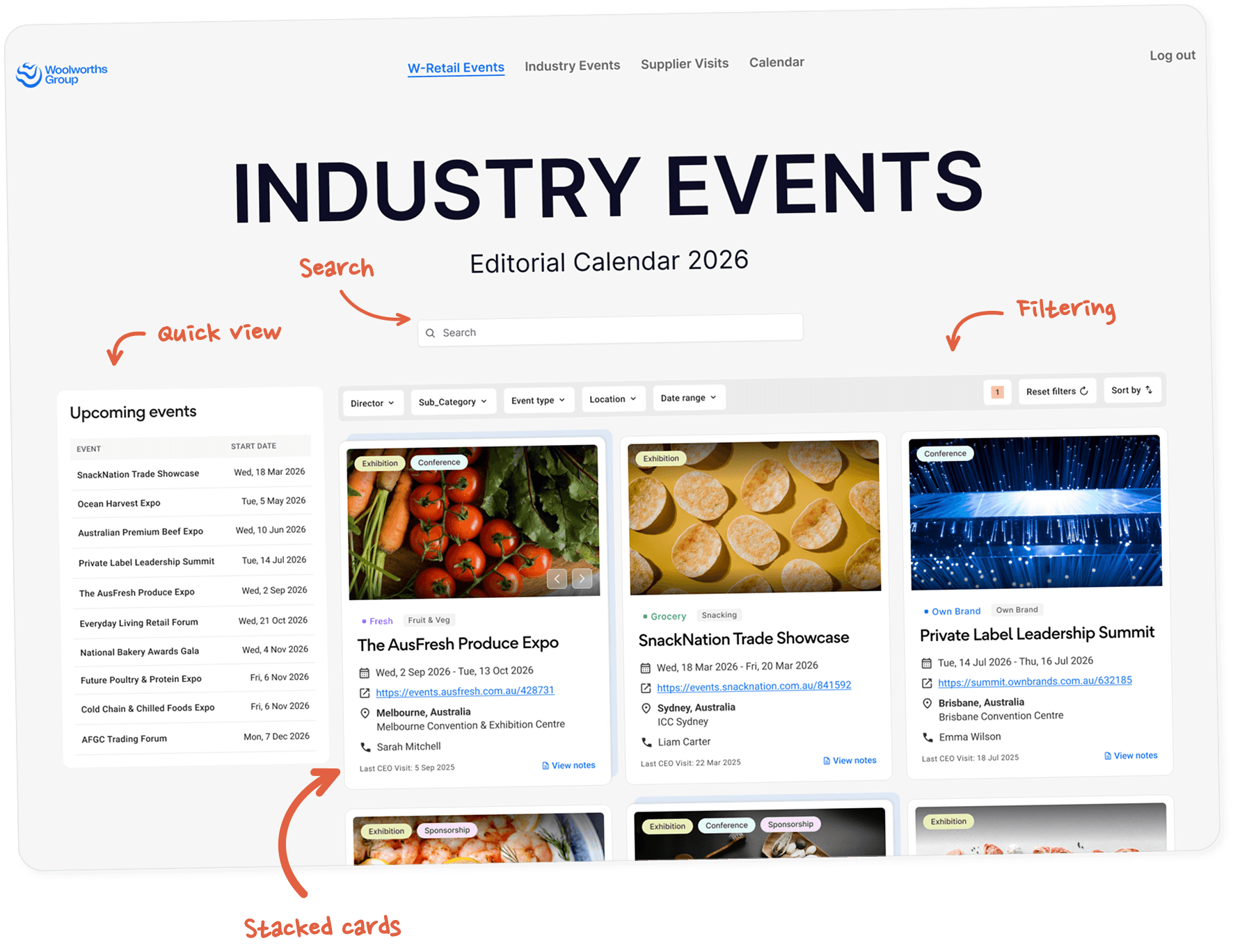
Powerful Search & Filtering
Users could search instantly while filtering by director, team, location, event type, category and date.
Multiple filters worked together seamlessly without overwhelming the interface.
Smarter Event Organisation
Events occurring across multiple years were grouped into stacked cards, reducing duplication while preserving historical information.
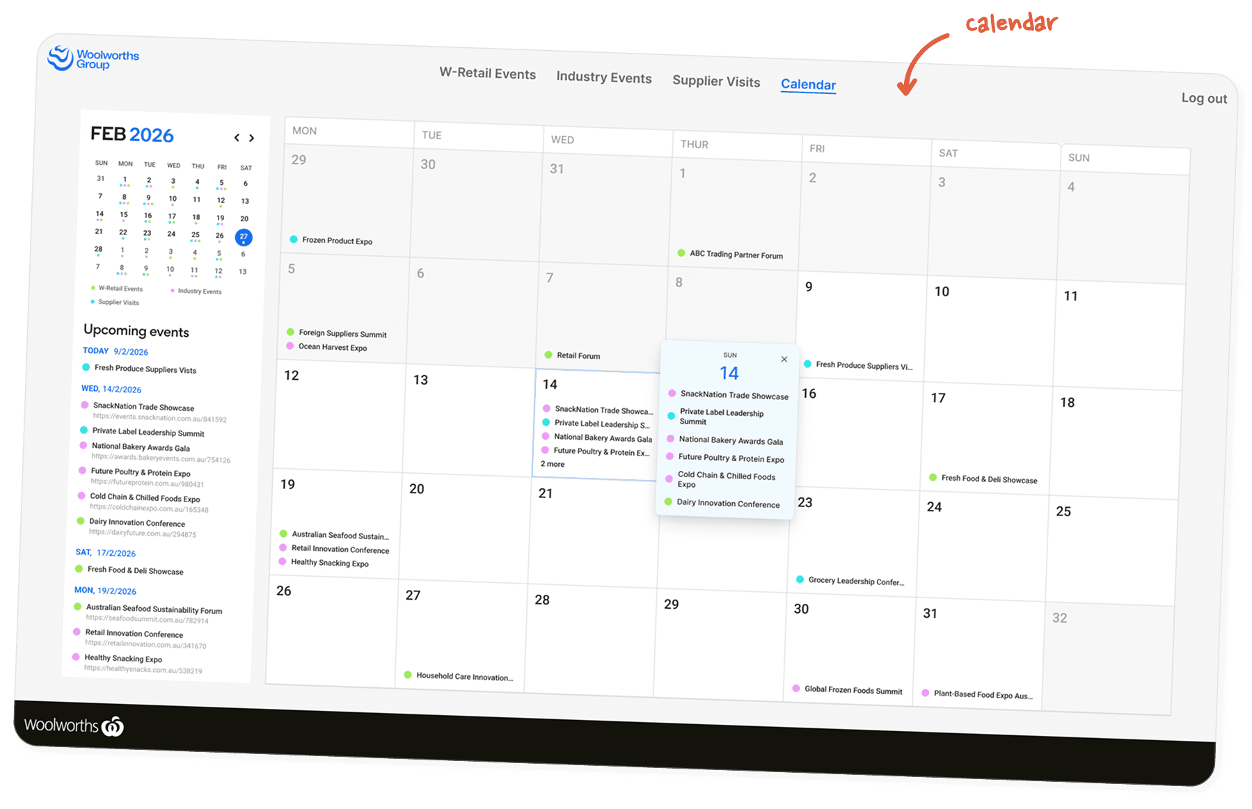
Calendar View
A secondary calendar experience supported planning workflows by providing a chronological overview of upcoming events.
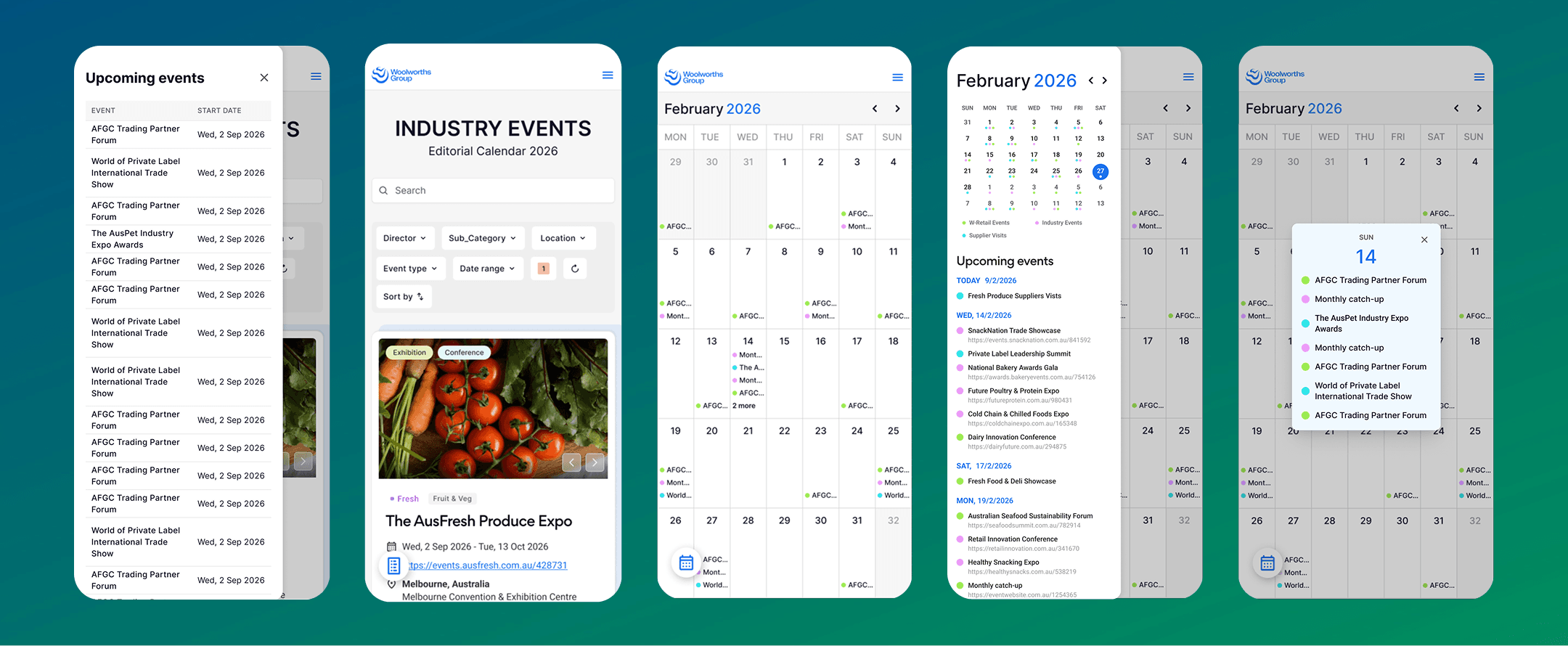
Responsive Experience
Desktop layouts prioritised information density while mobile layouts adapted interactions for touch-friendly navigation through full-screen dialogs and simplified controls.
Final Experience
- Search-first navigation
- Calendar planning
- Multi-filter system
- Responsive layouts
- Stacked event cards
Designing For Complex Filtering
One of the biggest UX challenges was handling the interaction between filtering, sorting and grouped event cards.
Events with identical names often occurred across multiple years. Stacked event cards were introduced to grouped related events together while still allowing filters to behave predictably.
This ensured users could:
- filter without losing relevant results
- sort events logically
- browse historical and future events efficiently
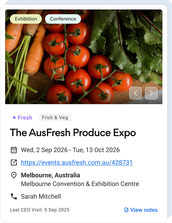
Teams can discover relevant events without navigating large spreadsheets.
Responsive Experience
Internal teams often accessed event information while travelling or attending events, making a responsive experience essential.
Product 02
New Releases Platform
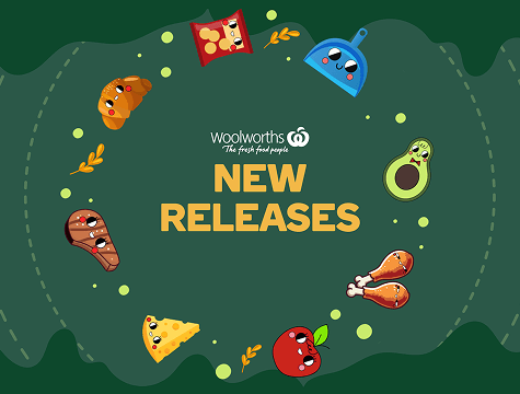
A centralised platform helping teams discover upcoming product launches.
Challenge
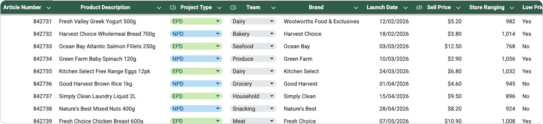
Upcoming product launches were tracked in a shared spreadsheet containing operational and launch data. While comprehensive, the spreadsheet wasn't designed for exploration, making it difficult for teams to quickly discover products relevant to their category.
Design Objectives
- Transform spreadsheet data into a product-first browsing experience
- Improve discoverability through search, filtering and category navigation
- Reduce cognitive load by surfacing only relevant information
- Create a scalable design that could support multiple business teams
- Introduce moments of delight without compromising usability
Before
Key Design Decisions
Category-First Navigation
Although every launch existed within a single dataset, each business team primarily focused on products within their own portfolio.
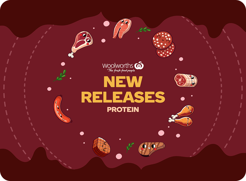
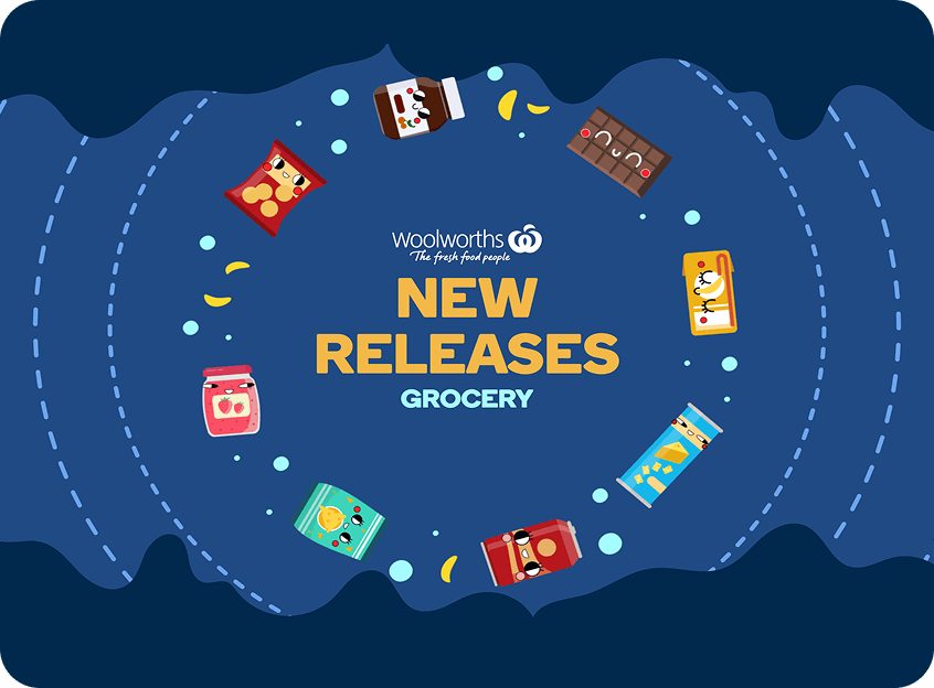
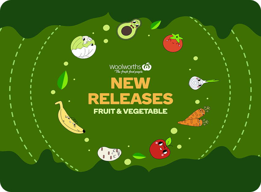
Instead of asking users to repeatedly filter the same spreadsheet, dedicated category experiences were created for:
- Grocery
- Fresh
- Protein
- Fruit & Vegetable
This allowed each team to immediately enter a familiar, relevant environment.
From Spreadsheet Rows To Product Cards
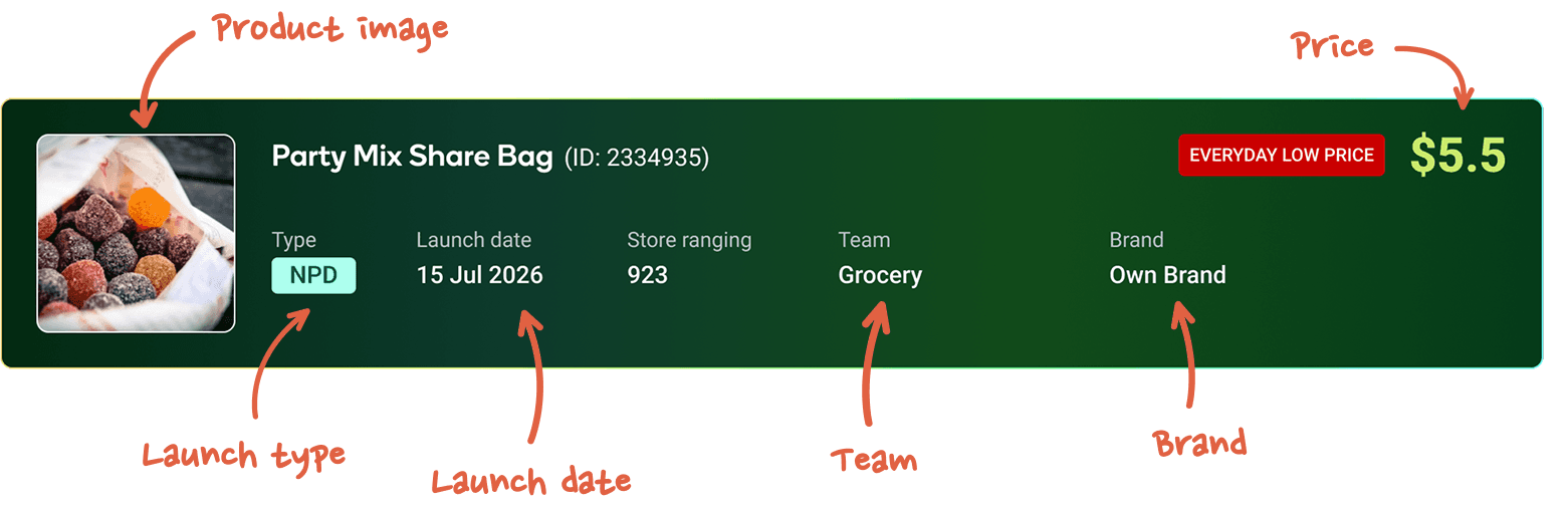
Each launch became a dedicated product card. Every card surfaces the information users need most.
Search and filtering remained central to the experience, allowing teams to quickly narrow hundreds of upcoming launches by:
- Launch Type
- Brand
- Team
- Launch Date
Sorting options further supported different planning workflows.
Final Experience
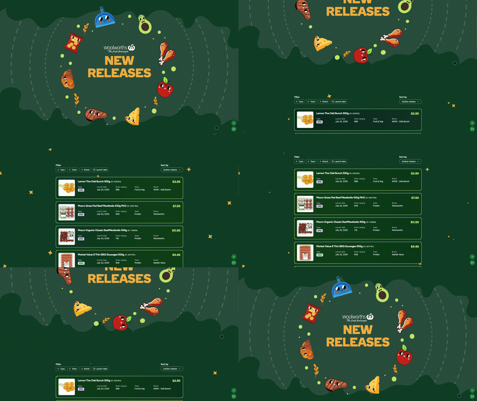
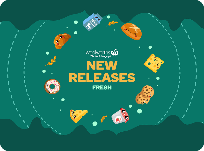
Each business area received a tailored visual identity while sharing the same underlying product experience.
Bringing Delight To Enterprise Software
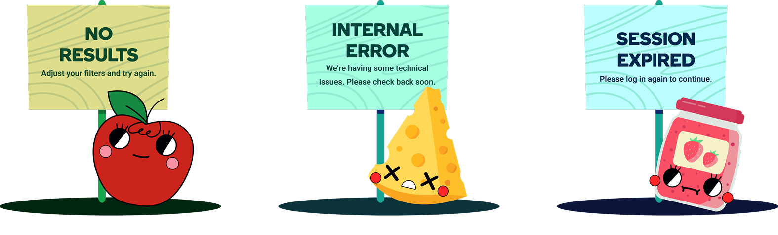
Because the platform was an internal tool, there was an opportunity to make the experience more engaging without compromising clarity or speed.
I explored lightweight motion and illustration to give each category a distinct identity while keeping the underlying interaction patterns consistent.
Product 03
Compliance Review Platform
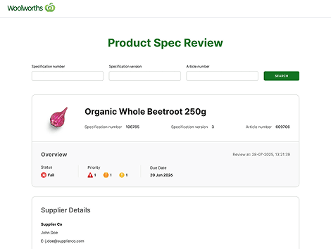
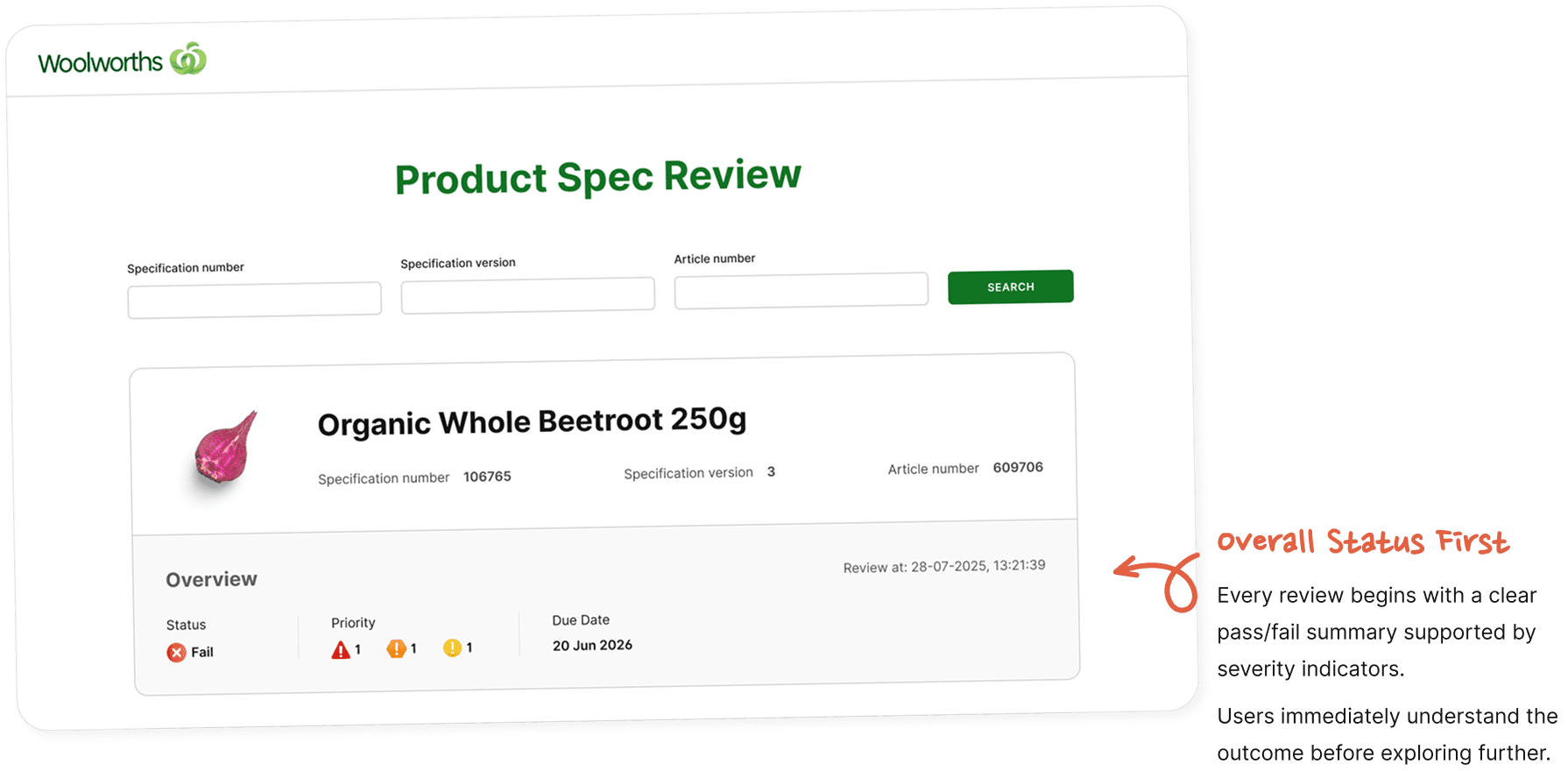
A layered review experience that helps users quickly understand AI-generated compliance findings.
Context
As part of Woolworths' broader AI transformation initiative, multiple enterprise systems - including Sphere, Opal and Plexus - were consolidated into a unified Google Cloud data platform.
AI agents automatically reviewed product specifications against business rules.
My role focused on designing the interface that transformed these complex outputs into experiences users could quickly understand and trust.
Problem
Compliance reports contained hundreds of validation checks spread across multiple product attributes.
Users needed to rapidly determine:
- Has this specification passed?
- What are the highest priority issues?
- Which sections require attention?
- What evidence supports each finding?
The challenge was to reduce information overload without hiding important detail.
Design Objectives
- Surface critical information immediately
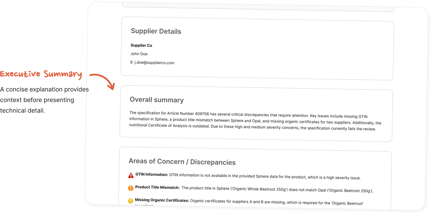
- Improve information hierarchy
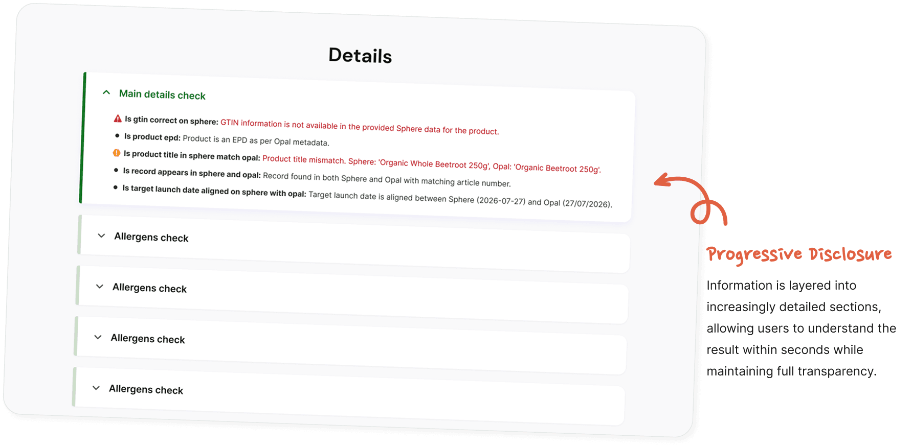
- Support progressive exploration
- Increase trust in AI-generated findings
Solution
The experience was designed around a layered information hierarchy.
Designing For Trust
Because the platform presented AI-generated findings, clarity became just as important as accuracy.
Visual hierarchy, severity indicators and expandable content clearly differentiate between:
- critical failures
- warnings
- informational checks
- supporting evidence
The result was an interface that communicated confidence without overwhelming users with technical detail.
What I delivered
Across these projects, I delivered responsive web experiences that translated complex datasets and operational requirements into clearer ways to browse, filter and review information.
- Industry Events: Search, filtering, calendar and responsive event browsing.
- New Releases: Category-first product discovery, filtering and product-focused layouts.
- Compliance Review: Layered information hierarchy for reviewing AI-generated findings.
Reflection
Designing enterprise products taught me that the biggest challenge was never simply creating polished interfaces, it was understanding how people make decisions within complex systems.
Across every project, I found that the greatest improvements came from organising information thoughtfully, reducing cognitive load and presenting the right information at the right time.
These projects strengthened my interest in Product Design because they showed me that good design starts with understanding the decisions, constraints and information behind the screen. I'm continuing to build on that foundation by developing stronger skills in problem framing, research and end-to-end product thinking.
Next Projects