RealSwipe
Repositioning a social discovery app that everyone mistook for a dating app.
- Role
UX/UI Designer
- Client
RealSwipe Founder | ProjectUX x UTS
- Duration
8 Weeks
- Team
5 Designers
- Deliverables
UX Research
Usability Testing
Prototyping
Overview
RealSwipe is a social discovery platform that helps people meet through shared experiences at live venues and events. The app encourages spontaneous, real-world interactions through nearby hotspots, events and communities.
Over eight weeks, our team partnered directly with the founder to evaluate the existing product, uncover usability issues and redesign key parts of the experience.
What initially appeared to be a visual redesign quickly became something much bigger.
The core challenge wasn't usability. It was perception. Users fundamentally misunderstood what the product was trying to be.
The Challenge
During usability testing, every first-time participant reached the same conclusion: "This is a dating app."
The app was designed for social discovery, but everything from the onboarding experience to the interaction patterns suggested romance instead of community. As a result, RealSwipe was attracting the wrong expectations while pushing away the audience it was built for.
We framed the problem as:
"How can we redesign the product so people immediately understand it's for social discovery?"
Research
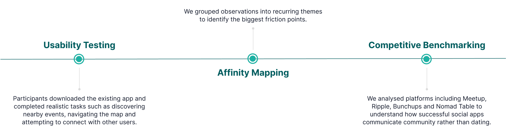
To understand why users were forming the wrong impression, we combined usability testing with competitive research and collaborative synthesis.
Key Insights
Our research uncovered one dominant insight.
Users misunderstood the product before they even started using it.
Several design decisions unintentionally reinforced the mental model of a dating app.
Romantic First Impression
The onboarding imagery and messaging resembled dating applications, immediately setting the wrong expectation.
Passive Event Discovery
Although RealSwipe centred around live events, the map failed to communicate activity. Users struggled to understand where people were gathering, what was happening nearby or how to participate.
Swipe-First Interactions
Profile cards prioritised appearance over shared experiences. Limited profile information, heart icons and swipe gestures encouraged users to judge people instead of discovering communities.
Solution 01
Creating the Right First Impression
Problem
Users formed an incorrect impression within seconds of opening the app.
The onboarding sequence highlighted romantic imagery without explaining what RealSwipe actually offered.
Design
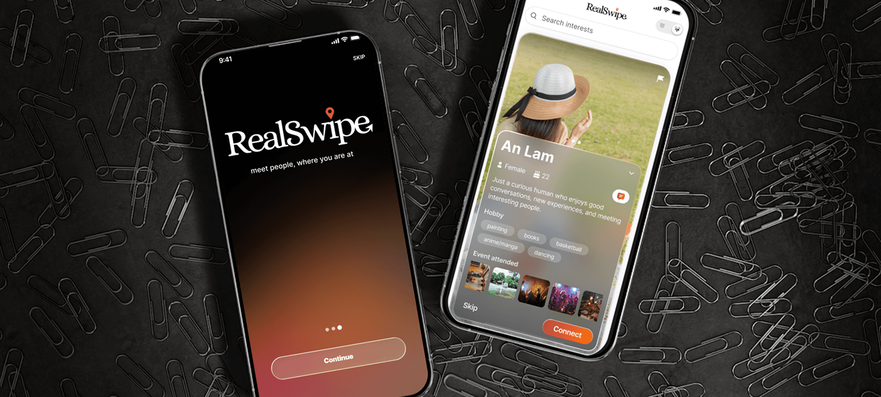
We redesigned the onboarding experience to communicate social discovery from the very first screen.
The new experience:
- replaced romantic cues with social energy.
- showcased different social scenarios including friendships, networking and events
- adopted a visual language that resonated with Gen Z
- clearly communicated the platform's purpose before users entered the app
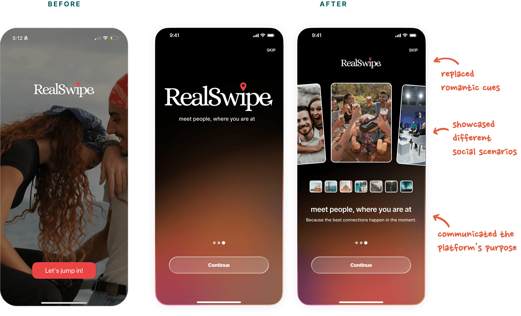
Users immediately understood it as a place to meet people through shared experiences.
Solution 02
Turning the Map into a Discovery Engine
Problem
Important content was hidden, navigation was unclear and users struggled to discover nearby activity.
Design
Instead of treating the map as a background feature, we transformed it into the centre of the experience.
Key improvements included:
- expanding nearby activities by default
- redesigning hotspot and event cards
- clearer Cheetah and Panda mode switching
- search, filtering and date selection
- improved event creation flow
- stronger navigation hierarchy
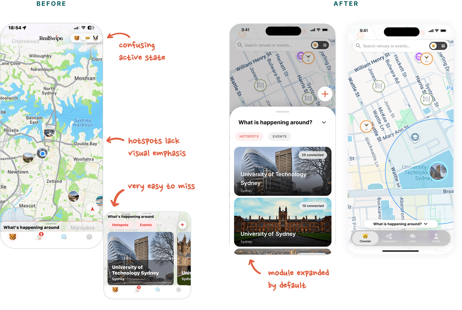
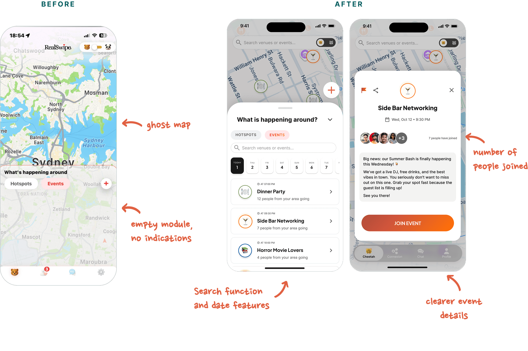
The experience shifted from browsing an empty map to actively discovering nearby venues, events and communities.
Solution 03
Designing Profiles Around Shared Experiences
Problem
Existing profile cards encouraged quick appearance-based decisions.
Users had very little context beyond a photo, making interactions feel transactional and dating-oriented.
Design
We redesigned profile cards around common interests instead of physical appearance.
Profiles now highlighted:
- hobbies and interests
- shared events
- richer biographies
- expandable profile details
- clearer interaction hierarchy
- a dedicated Connect action replacing dating-inspired gestures
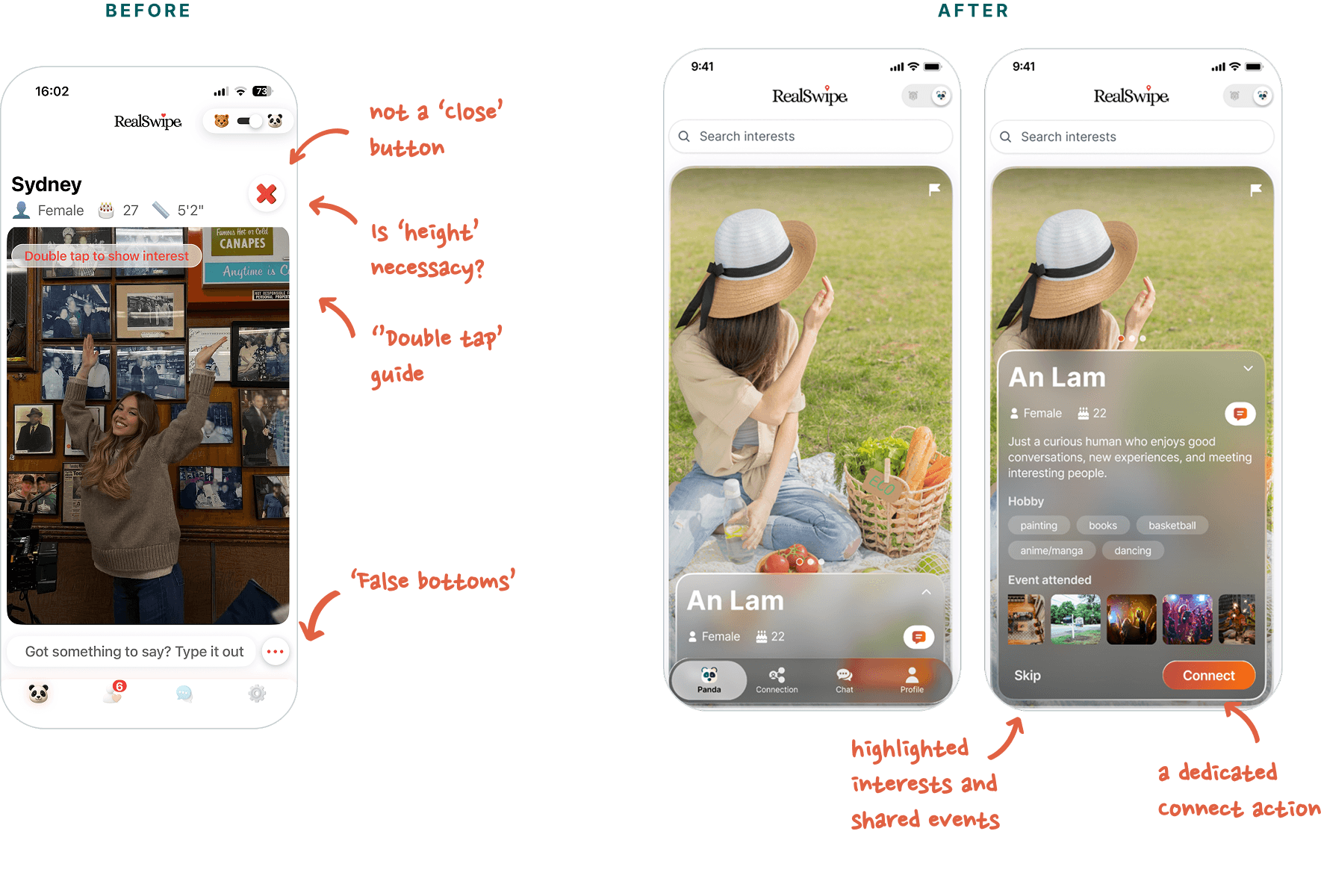
Connections became grounded in shared experiences rather than first impressions.
Design Principles
Throughout the project we established three principles that guided every design decision.

Social Before Romantic
Every interaction should reinforce community rather than dating.

Context Before Connection
Users should understand who someone is through shared interests, activities and events before deciding to connect.

Discovery Before Matching
Finding experiences should become the primary journey, with meeting people naturally following from participation.
Reflection
At first glance, the project appeared to be a visual refresh. However, user research revealed that the real challenge wasn't aesthetics, it was perception. The interface consistently communicated the wrong message, shaping expectations before users had a chance to experience the product's true value.
This project reinforced that successful product design starts with identifying the right problem. By grounding every design decision in research and aligning each interaction with a clear product narrative, we were able to reposition the experience from a dating app to a platform centred on social discovery.
More importantly, collaborating directly with the founder showed me how design can influence not only usability, but also product strategy and brand perception. It strengthened my belief that great UX is about creating experiences that communicate purpose as clearly as they support interaction.
Next Projects